Mobile-FirstFintech
Rebuilding VitalSwap around a peer-to-peer currency marketplace
From another remittance app to a two-sided marketplace where better rates were the product.
From another remittance app to a two-sided marketplace where better rates were the product.
TRANSACTION VOLUME
Transactions doubled in the first month after launch as users adopted the marketplace as a better-value way to move money.
MARKETPLACE ADOPTION
Marketplace adoption was strong from day one, giving VitalSwap a clearer product position than a generic remittance flow.
TRUST & SUPPORT
Support dependency dropped as users completed transfers and swaps independently with more confidence in rates, fees, and confirmation.
VitalSwap competed in one of the most commoditised corners of consumer fintech: diaspora remittance. Users sending money home for rent, school fees, medical bills, and family support weren't making casual transfers. They needed speed, but more than that they needed certainty about where the money was going, what rate they were getting, and what would happen next.
The functionality worked. The experience didn't. Users started transfers and stalled at the moments that mattered most, around rates, fees, and confirmation, then turned to support to finish what should have been routine.
That support dependency was the symptom I cared about least. The real cost was structural. Every hesitation leaked trust, and in a category where users can't see the rails underneath the product and judge safety entirely through the interface, leaked trust is leaked retention. The value was real, but users couldn't feel it clearly enough to come back, and "another transfer app" is not a position you win from.
I started outside the screens, in the support tickets, complaints, internal feedback, and the exact steps where users asked for help. The pattern showed up fast, and it reframed the problem: users weren't trying to send money. They were trying to make sure they were getting a fair exchange.
They compared rates across apps, screenshotted them, did the maths by hand, and delayed transfers when they weren't sure. No amount of tidying the transfer screens would answer the question users were actually asking. The product needed to make better exchange outcomes visible and trustworthy inside the experience itself.
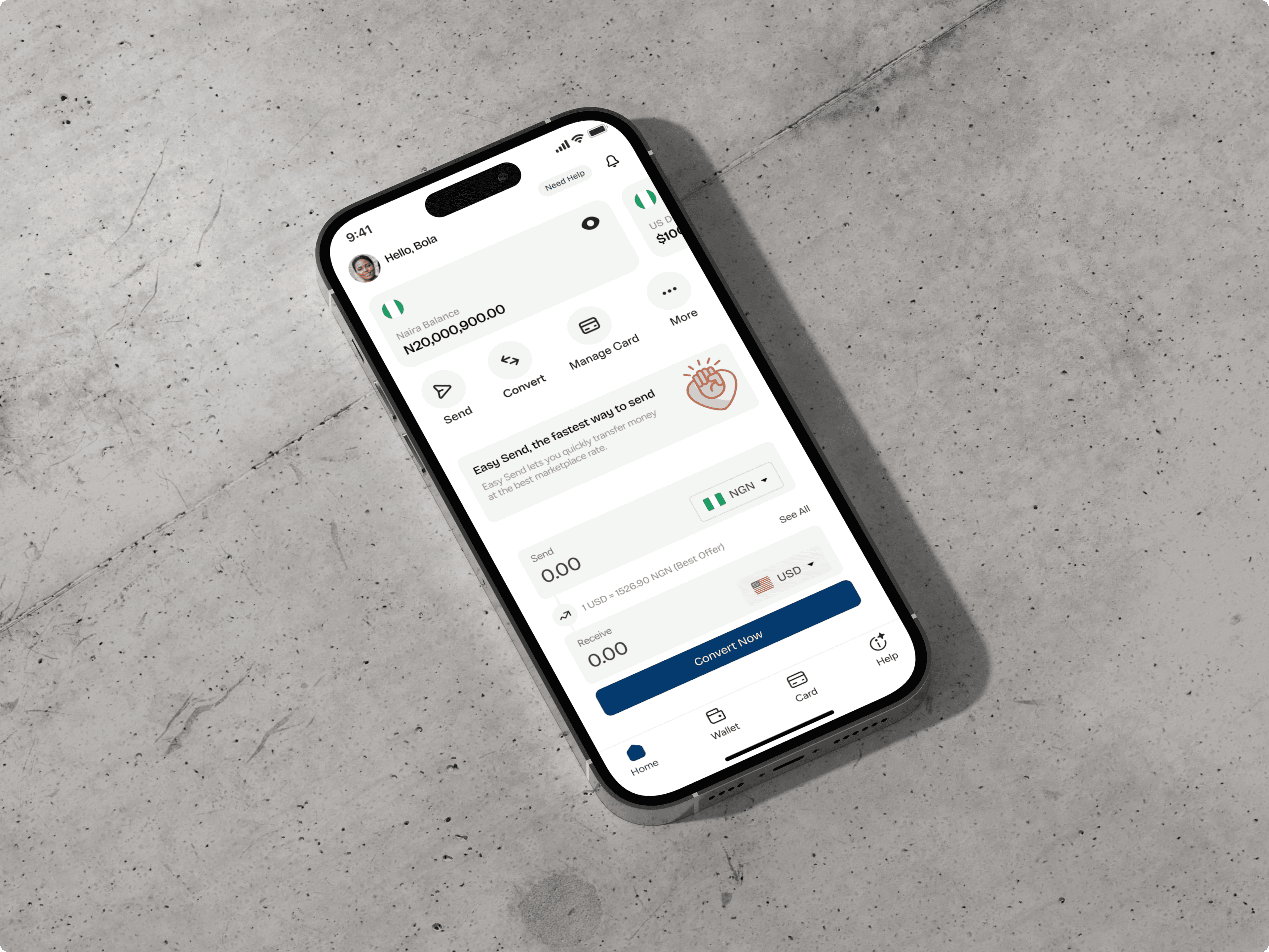
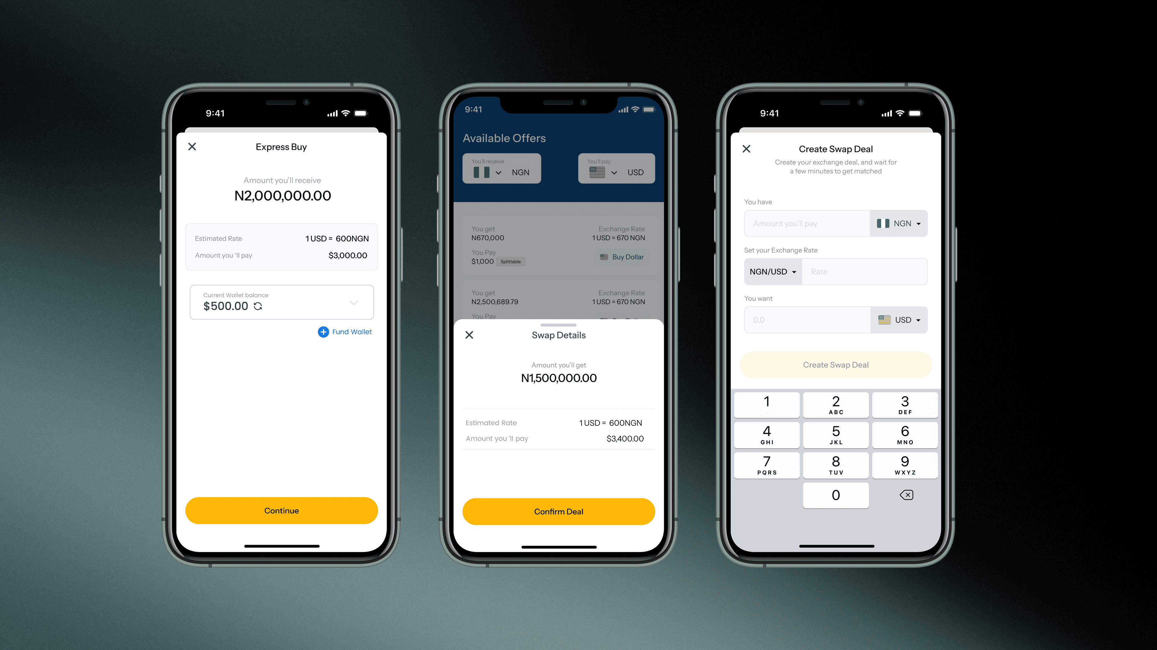
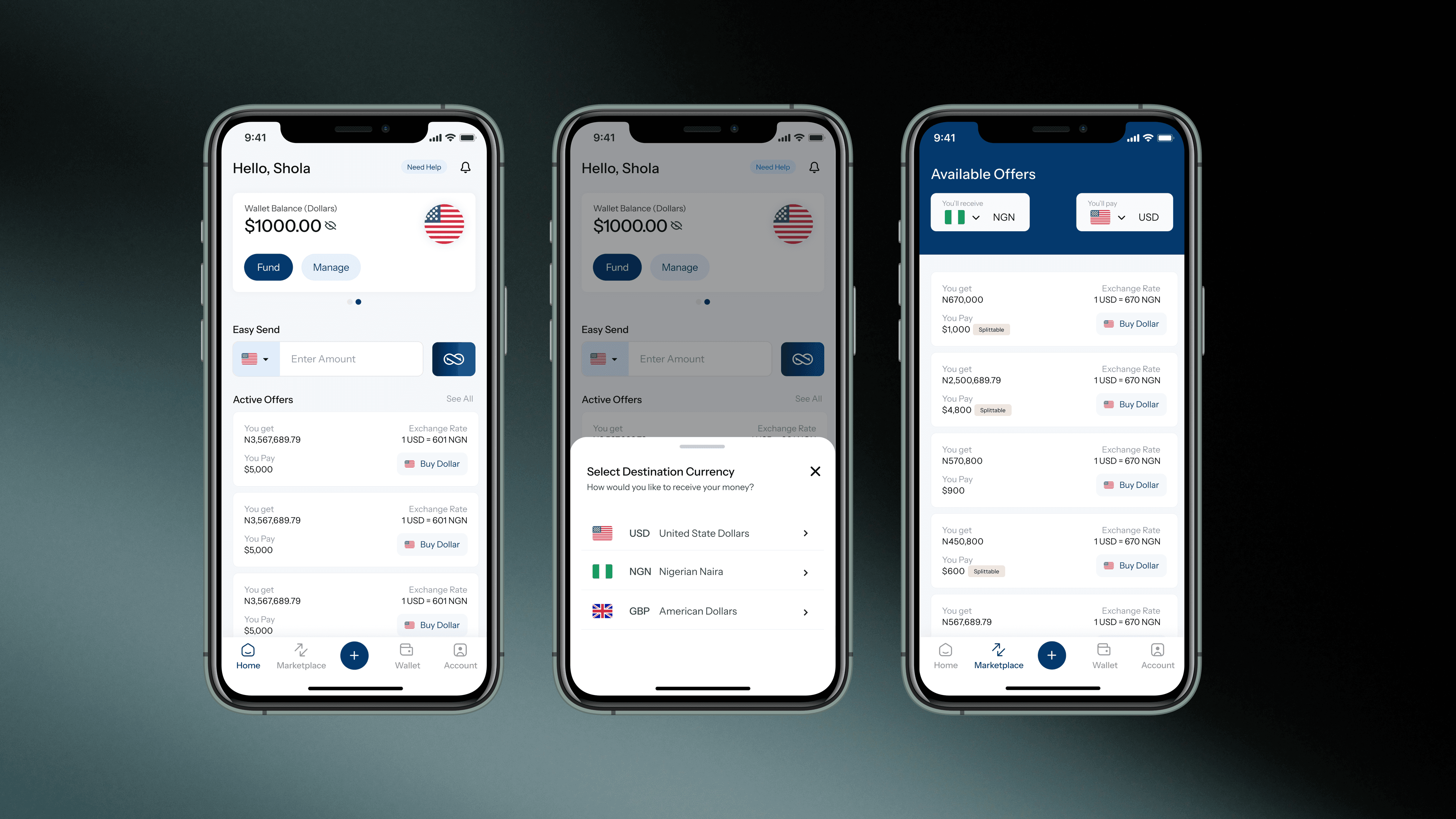
So I made the harder call. Instead of polishing the transfer flow, I rebuilt VitalSwap around a peer-to-peer currency marketplace, where users holding USD and users holding NGN could swap directly with each other at rates better than the banks offered. That was a bigger bet than a redesign. It changed what the product was.
It was also a much more complex thing to design, and most of the work went into hiding that complexity. A two-sided marketplace has to solve for trust between strangers, not just between a user and an app. I designed for the parts users feel, the rate, the amount, availability, who is on the other side, and how protected they are, while the matching, liquidity, and verification logic underneath stayed out of their way. The bet only worked if a structurally more complicated product felt simpler than the old one.
That forced real tradeoffs:
The highest-risk moment was still completion, so I made commitment unambiguous. Before sending, users saw it all in one place: what they were sending, what they would receive, the rate, fees, verification status, and what came next. No mental maths and no surprises, the whole transaction legible before any money moved.
Transactions doubled in the first month, and marketplace adoption was strong from launch. Support dependency dropped as users completed key flows, marketplace swaps included, without needing someone to walk them through it.
The outcome I care about most is positional. VitalSwap stopped being another transfer app and became a place to find better exchange opportunities, with a two-sided loop underneath it: more participants meant deeper liquidity, deeper liquidity meant better rates, and better rates gave people a sharper reason to return. Design didn't just lift the numbers. It changed the moat.
The real shift was confidence. In consumer fintech, users can't see the payment rails, so they judge safety through the interface. VitalSwap worked when the experience made the money movement feel clear, controlled, and fair. The marketplace gave people a reason to choose it; the design gave them the confidence to act on it.